Slowdowns
Introduction
The Slowdowns dashboard enables the user to compare the performance of a target transaction(s) between the current timeframe and a rolling baseline window. This dashboard provides an overview of the volume of calls, response times and failure rates of each of the entry points (i.e., transaction handlers) into the target environment(s) and application / deployment filters.
Learn how OverOps Calculates the Reliability ScoreClick here for a visual overview of the OverOps dashboards, and the way they all connect to provide QA, DevOps and SRE teams a complete picture of application reliability across multiple environments.
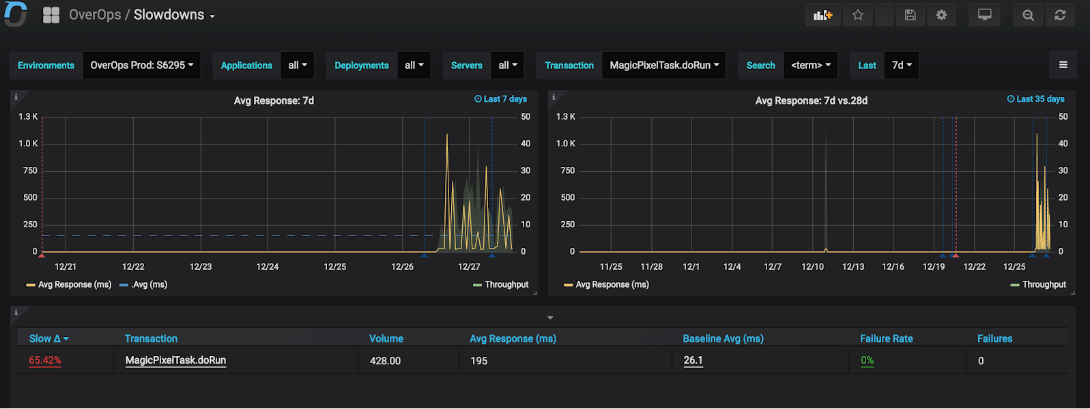
The left hand graph shows the avg. response time of the selected transaction(s) within the current timeframe. The right hand graph shows the baseline and active windows side by side. The dashed red line annotation shows when baseline end and the active windows begins.
Clicking each transaction name in the table will jump to the OverOps Automated Root Cause (ARC) analysis for this transaction that will show exactly the complete state of the transaction at the moment where it exceeded the threshold. This enables developers and SREs to see the actual state within the application that caused that delay to understand whether the cause of the slowdown is code or infrastructure related.
Additional Information
- Clicking one of the top indicators takes you to the Errors-drill down Dashboard, which provides a zoom into an event type.
- The indicators (top boxes) enable easy filtering according to important event types: uncaught, critical, HTTP Error, and log error.
- All errors are ranked in the dashboard.
Slowdowns Dashboard JSON ModelCustomize the dashboard, or integrate any of the widgets in it using the Grafana JSON Model of this dashboard.
Updated about 1 year ago