Site Reliability Dashboard
About the Site Reliability Dashboard
This dashboard provides a high level view of the reliability of any application, deployment or code tiers with the selected environment(s).

The dashboard is divided into three main sections
Environment Filters and High-level Indicators
This section enables the user to select the target environments, application, deployments, tiers and transaction groups they would like to inspect. Once a selection is made (jumping into this screen from the Reliability Scorecard dashboard carries over any selections into this dashboard automatically) the data will be retrieved within a few seconds and the dashboard views will be rendered accordingly.
The high-level indicators below the filters section show a series of KPIs highlighting:
- The Reliability score calculated according to the weights defined in the Settings dashboard.
- The number of transaction whose performance compared to their baseline is slow.
- The transaction failure rate which indicates the ratio between the number of errors defined as transaction failures within the Settings dashboard (by default: HTTP errors, uncaught exceptions ang logged errors).
- The number of new errors (both P1 and P2) introduced in the selected timeframe.
- The number of errors who have increased (regressed) by more than the rate thresholds defined in the Settings dashboard.
- The overall number of unique errors within the selected timeframe and filters. This is comparable to the event view available at app.overops.com

The high-level indicators available from within the dashboard.
Clicking each of these high-level indicators jumps to their corresponding drill down dashboard to provide additional context and root cause analysis for each of the anomalies highlighted.
Errors and Throughput Graphs
The middle section of the dashboard shows the number of calls into the application (i.e. throughput). Each time control is passed by the JVM threading system or web container to application code, the invoked method is called an Entry Point or Transaction. OverOps automatically detects this passing of control, counting the number of times this takes place as well as the time this call takes to complete. The overall number of calls into application code is defined as the application’s Throughput. OverOps automatically detects and places all entry point classes in the Transactions selector.
Users also select any subset of entry point classes based on specific logical or business groupings. For example, users may want to differentiate between entry points receiving requests from users via web / mobile frontends (e.g. Servlets) and background tasks used to process specific types of messages. This can easily done by defining custom Transaction Groups via the Settings Dashboard. Transaction groups that have matching entry point classes within the current filter set will automatically appear in the Transactions selector.
The “Avg Response “graph on the left charts the overall number of calls into the currently selected transaction or transaction groups in green, overlaying on top of that their avg. response time. This gives a high-level indications of the applications’ liveliness. All transaction groups matching the current filter set will also show their avg. response as individual time series on the graph.
To the right of the avg. response graph is the “Errors by Tier”. This graph renders the current throughput in green, similar to the avg. response graph. Overlaid on the throughput graph is a set of time series describing the volume of the errors with the current code tiers.

The avg. response and errors by tiers graphs give a high level indication of the liveliness of the selected applications, deployments or tiers within the selected environment(s).
OverOps automatically categorizes all errors within the selected environment(s) according to the layer in the code from which they originated. For example, an error returned from a MySQL DB will be labeled as part of the “MySQL” tier, whereas an error originating from a failure to perform an operating against an AWS service (e.g AWS S3) will be marked as part of the “AWS-S3” tier. This provides DevOps/SRE a horizontal view as to the reliability of key infrastructure components within their environment.
Users can also use the Settings Dashboard to define Key Tiers, which can be either 3rd party tiers (e.g. MySql, Redis, Kafka) or reusable code components within their code that are used horizontally across multiple applications.
The “Errors by Tier” graph shows the volume of errors within each of the defined key tiers overlaid on top of the applications’ throughput. If no key tiers are defined, the tiers who are experienced the highest volume of errors within the selected timeframe are presented.
The “Type” selector enables user to filter errors presented in this dashboard to specific event types (e.g. Logged Error, Uncaught Exception), tiers (e.g. AWS, MySql, Guava) or specific exception types (e.g. NullPointerException, SqlException). The graph will reflect this selection, enabling users to focus in on the error volume of a specific tier(s).
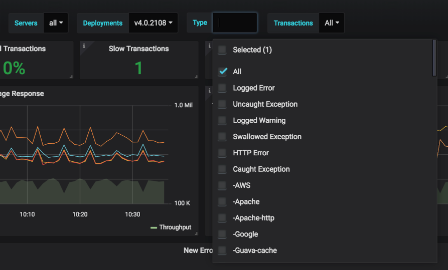
The “Type” selector lets the user filter the scope of error analyzed and scored to a specific subset, based on event type (e.g. Logged Error), tier of origin (e.g. AWS, MySQL,..) or a specific exception type (e.g. NullPointerException).
Anomaly Detection
The bottom section of the graphs shows breakdowns of any new errors, increasing errors (regressions) or slowdowns. Each items is prioritized as either P1 or P2, based on the thresholds set within the Settings Dashboard.
Clicking each item will jump to a drill down which will provide deep context as to its cause and frequency.

The anomaly detection section of the dashboard shows all new errors, increasing errors (regressions) and slowdowns within the selected environment(s) and any additional applied filters.
Clicking a new error will take the user to the OverOps ARC (Automated Root Cause) analysis screen to see the combination of source code and variable state which brought about this error. This can enable a team to quickly differentiate whether the cause of the new error is a programmatic error (i.e. caused by code) or an operational error (i.e. caused by the infrastructure or environment). From the ARC screen the team can also directly open and assign a Jira ticket (or alternatively have that be done automatically by OverOps).
Clicking an Increasing error will take the user to the “Increasing Errors ” screen, where this error will automatically be selected. Within that screen, the user can see exactly the increase in volume (both absolute and relative to throughput) between the current time frame and its baseline. The “Rate D” column will show the user the difference in percentage (i.e. how frequently does this error occur) between the current timeframe and the baseline against which it is compared (hovering over the “Rate D” value will show the actual percentage calculation : times the error occurred in the current timeframe divided by the times during baseline period). This screen will also allow direct access to each increasing error’s ARC analysis, to enable the user to see the reason (programmatic or operational) that caused this error to increase / regress.
Clicking a Slowdown will take the user to “Slowdowns” screen with the selected transaction automatically pre-selected. Within this screen the user can compare the avg. response time of the selected transaction within the selected timeframe and its baseline period. The “Slow D” column will show the difference in response time (ms) between for that transaction between the current timeframe and the baseline period against which its performance is compared (hovering over the “Slow D” value will show the actual percentage calculation).
This screen will also allow direct access to each slow transaction’s ARC analysis, to enable the user to see the reason (programmatic or operational) that caused this transaction to slow down.
Learn how OverOps calculates Reliability ScoreClick here for a visual overview of the OverOps dashboards, and the way they all connect to provide QA, DevOps and SRE teams a complete picture of application reliability across multiple environments.
Site Reliability Dashboard JSON ModelCustomize the dashboard, or integrate any of the widgets in it into your Grafana using the Grafana JSON Model of this dashboard.
Updated about 1 year ago