Performance
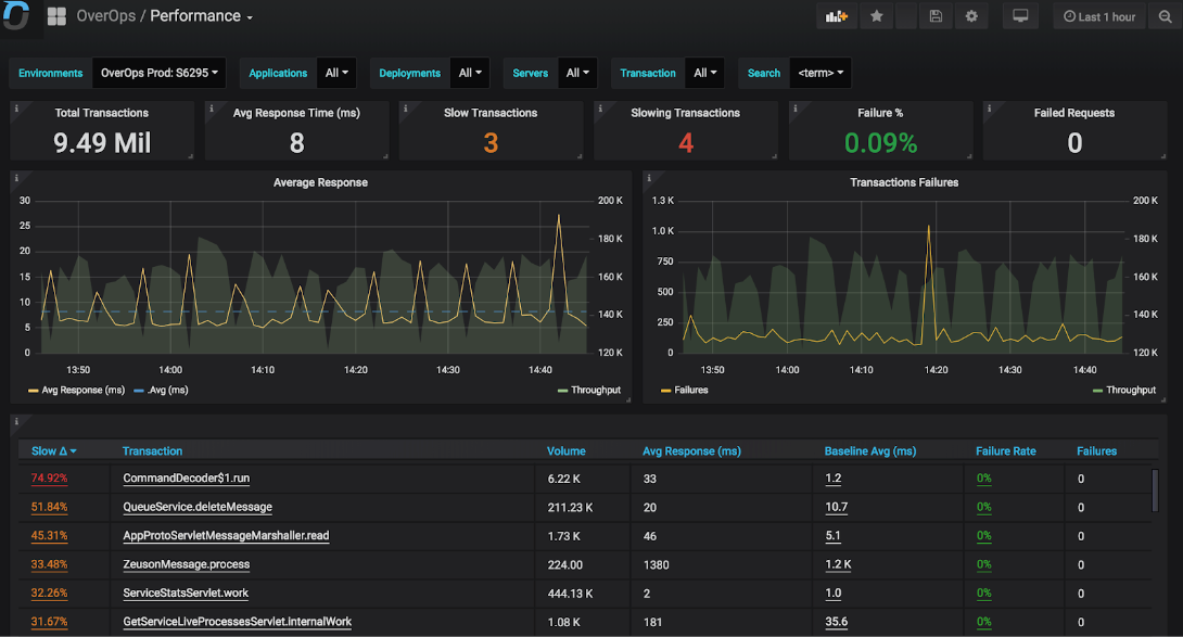
The Performance dashboard provides an overview of the volume of calls, response times and failure rates of each of the entry points (i.e. transaction handlers) into the target environment(s) and application / deployment filters.
Learn how OverOps Calculates the Reliability ScoreClick here for a visual overview of the OverOps dashboards, and the way they all connect to provide QA, DevOps and SRE teams a complete picture of application reliability across multiple environments.
At the top of the dashboard are the standard environments filters to enable observing the behaviour of any one of the environments to which the current datasource is connected, as well as slicing and dicing by a target application, deployment, server or transaction group.
The middle section of the dashboard features two primary graphs. The left graph features and overlay of the throughput (i.e. Overall number of calls into the selected transactions) on top which the avg. response times for the selected transactions is displayed. A horizontal dashed line shows the avg. response of all transaction across the selected timeframe.
The Transaction Failures graphs overlays on top of the throughput series of the select transactions the volume of events taking place within code locations called from within the selected transaction / entry points. The Settings Dashboard defines which types of events (e.g. Logged Error, HTTP Error, ..) are defined as transaction failures. The default values are: Logged Error, Uncaught Exception and HTTP Error, which signify the transaction was not completed successfully. Notice that as errors may be logged more than once per the execution of a single transaction (e.g. logging done from within a loop) the ratio of errors to transaction volume could be greater than one. For example a transaction who parses an incoming stream of values may encounter failures when processing 10 of these items, which will create a failure ratio of 10 for that transaction (10 logged errors to one invocation of the code entry point / transaction).
At the bottom of screen is a table that provides details for each of the active transaction within the selected time frame and current filters. If the state of the transaction is defined is Slow it is highlighted in red. If it is marked as “Slowing” it is marked in yellow.
Slowdowns. A transaction is deemed as slow if during the active window if the percentage of calls of calls whose response time is greater than the average in the baseline window + any number of std deviation defined in the Settings dashboard by the “Critical Slowdown Threshold” defined in the Settings is dashboard.
Clicking a transaction will open the Slowdowns Dashboard, automatically selecting the current transaction. Within this dashboard the user compare the performance of the transaction within the active selected timeframe and the baseline against which it is compared.
The “Failure Rate” column enables the user to drill down to see the exact errors taking place within the selected transaction within the Unique Errors Dashboard which will be automatically filtered for the selected transaction. For each of those errors the user can also click to jump into the ARC analysis screen to see the complete cause behind the error.
Performance Dashboard JSON ModelCustomize the dashboard, or integrate any of the widgets in it using the Grafana JSON Model of this dashboard.
Updated about 1 year ago